2020 Election Charts
Based on NYT / Edison Data - https://github.com/alex/nyt-2020-election-scraper
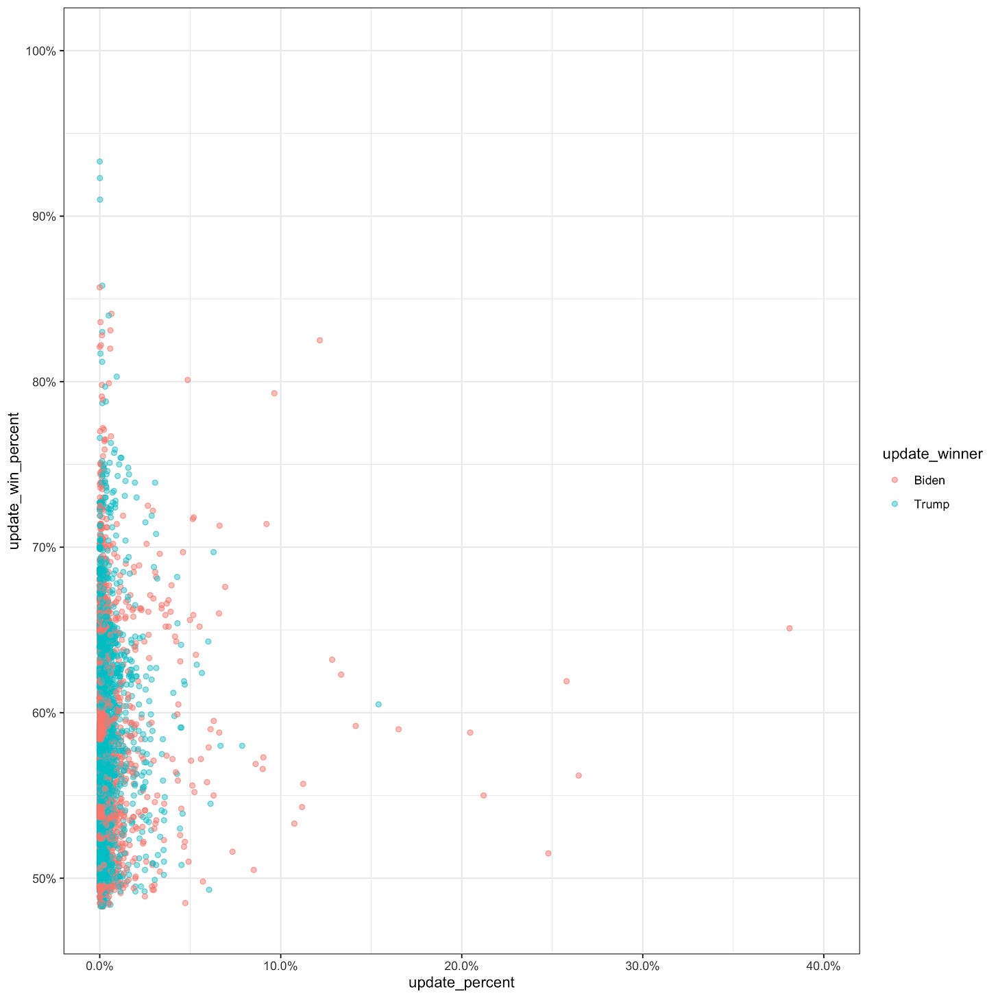
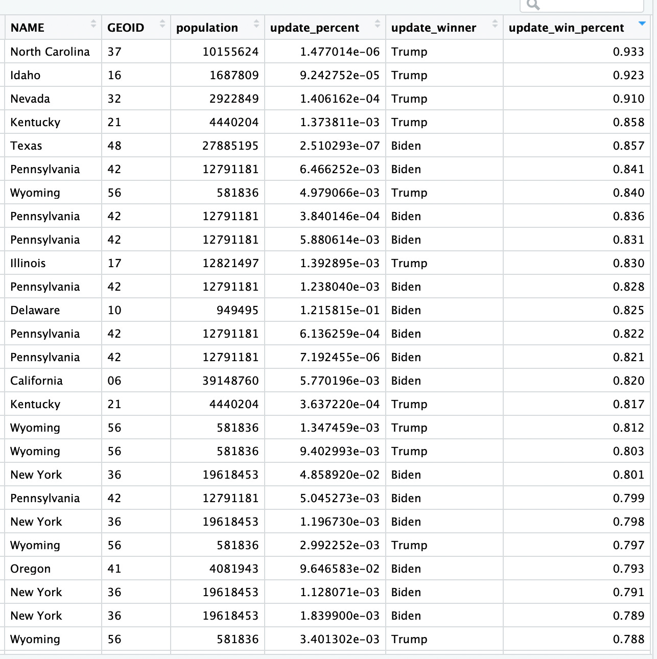
I wanted to share some observations on the same dataset that “Anomalies in Vote Counts and Their Effects on Election 2020” has been using to highlight non-anomaly “anomalies”. This first chart is intended to show the range variation in vote updates embedded in the the poster’s data set. Winning percentages range from about 93% for small updates down to about 48% in cases where a 3rd party candidate played a larger role. Here are the largest 20 or so updates by winning % of the lead candidate in that update. These are the real “anomalies”
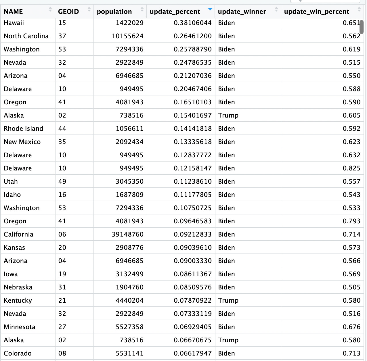
Update sizes range from 38% of a state’s entire population (Hawaii) to almost nothing. Here are the largest 20 or so updates as a % of the states’ population. These are more real “anomalies”
Summary of the updates each candidate “won”
Biden Trump
Winning updates 4327 5275
Mean votes per update 22K 11K


